Have you ever wondered how Llewellyn comes up with some of its beautiful cover designs? Today, to celebrate the release of The Witch’s Broom by Deborah Blake, I’m going to explain the process. Since it involves Deborah, it also involves a cute cat. So this post should interest book-lovers and cat-lovers alike!
Here at Llewellyn, a cover starts with what we call the Launch meeting of the book. Attended by the production editor, production manager, art director, cover designer, copywriter, publisher, and sales manager, it is the acquisition editor’s job (that’s me) to bring the author’s input to the table. I usually ask authors for their ideas on the final title, subtitle, and cover design of the book, asking them for specific examples of covers they like or don’t like, pictures that are inspiring or close to what they’re looking for, and so on. Sometimes the authors have lots of great ideas; sometimes just one idea that they are really, really attached to; and sometimes they say “you guys are the professionals, do whatever you think will be best.” I try to have everything at least a couple days before the meeting so I can prepare.
So, in April of last year, we had the Launch meeting for this book. We chose The Witch’s Broom: The Craft, Lore & Magick of Broomsticks as the title and subtitle but got stuck on the cover design. Deborah had requested an illustrated cover, perhaps showing a cat in front of a cottage with a broom leaning against the front door, under a full moon – or something along those lines. At the meeting we determined the book would be a small cute size (5” x 7”) and realized that having so many elements on an already small cover, the reader would barely notice the broom, which should be the star of the cover! Plus, this is the first book in a series – next year we’ll have The Witch’s Wand – so we talked about doing a simple cover with an iconic emblem of a broom on it, which could then be swapped out with other magical implements in future books. Am I ever glad we didn’t just stop there!
As soon as I got back on my computer after the meeting, I started brainstorming and finding adorably retro witchy pictures of brooms and witches. Seriously, go to Pinterest and you’ll find all kinds of vintage posters, postcards, and photographs of witches and their brooms. I immediately started bombarding Deborah and the cover designer with emails.
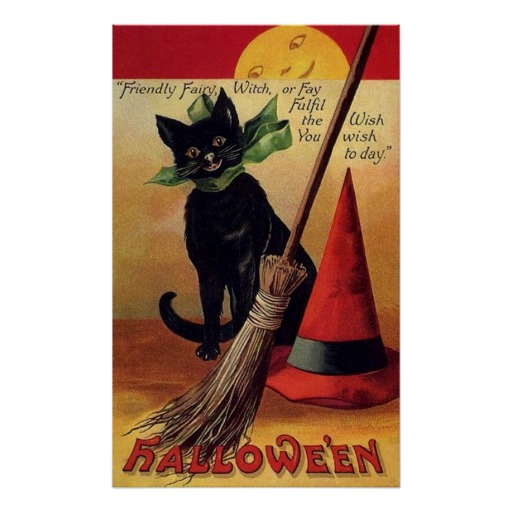
It wasn’t long before I found a postcard that both Deborah and I fell in love with. It was charming, vintage, had a cat in it (very important!) but most importantly, featured the broom front and center.
Deborah said she loved it with a burning passion. I got several emails to this effect, culminating in one message that read “PLEASE PLEASE PLEASE THIS ONE PLEASE.” Chuckle. Have I mentioned that our authors are powerful, passionate beings?
So we reconvened another Launch meeting to decide whether we should go with this retro look for this cover and the rest of the series. While we’d have loved to use that darling illustration, things aren’t quite that simple in the publishing biz. This image can be found all over the internet, and some companies will even sell you a poster of it. But that doesn’t mean that they own the rights to it. In fact, from the best I could determine, the image above was scanned in from a postcard that was postmarked Nov. 1, 1911 — meaning that the work should by now be in the public domain. The artist’s name was Ellen Clapsaddle and the publisher of the postcard was International Art Publishing Company. But even though something is in the public domain does not mean a commercial publisher can necessarily use it with impunity. Who owned the postcard, who scanned it in and made it accessible? (Sometimes libraries will charge a fee to reprint scanned images from books, for example, even if they were printed well over 100 years ago, citing property rights rather than intellectual property or copyright. And it’s a huge issue for museums, who want to control reproductions of works held in their collections regardless of when the art was created.)
Are you getting bored of the legal mumbo-jumbo yet? The TL;DR version is that no, we couldn’t use this exact postcard. Plus, it’s not like we’d magically find a vintage postcard perfectly corresponding to every future book in the series. (OK, maybe with a little magic…but we didn’t want to have to bank on that.) But there was a solution that solved both issues: since it was so old, we were within our rights to get a new version created by an artist. We could create our own mock-ups going forward and still get that same retro look. So that’s exactly what we did.
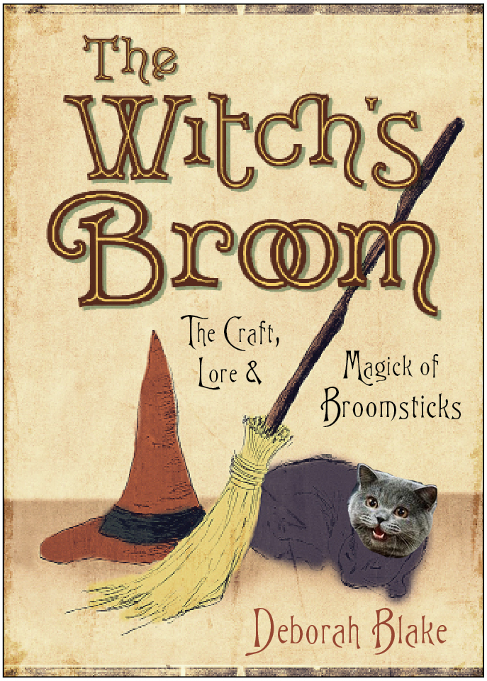
First, our stellar in-house cover designer Lisa Novak created a mock-up, showing how she’d like the illustration, the title, subtitle, and author’s name to come together to create a pleasing, balanced cover. This is what that step looked like:
It’s perfect, don’t you think? We sent it to Deborah (OK, we sent her a version without a LOLcat face on it) for her approval. Whenever I send a mock-up to an author, I have to clearly communicate to them that this is not, in fact, what the final cover will look like. I tell them what will stay the same (approximate placement, size, and color of all text elements, the illustration will include a hat, broom, and cat in that order); what will be different (the illustration is going to be amazing, don’t worry! Yes, the cat will be black not grey!); and remind them strictly not to share the file with anyone. We don’t want something like that accidentally getting uploaded to Amazon, do we now? In this case we did have alternate versions with the subtitle placed elsewhere, as you’ll see in the final version.
After this direction was approved by Deborah, Lisa sent the mock-up and concept to illustrator John Kachik, who has a lot of experience creating vintage-inspired art, along with the original postcard so he knew what style of art we had in mind.
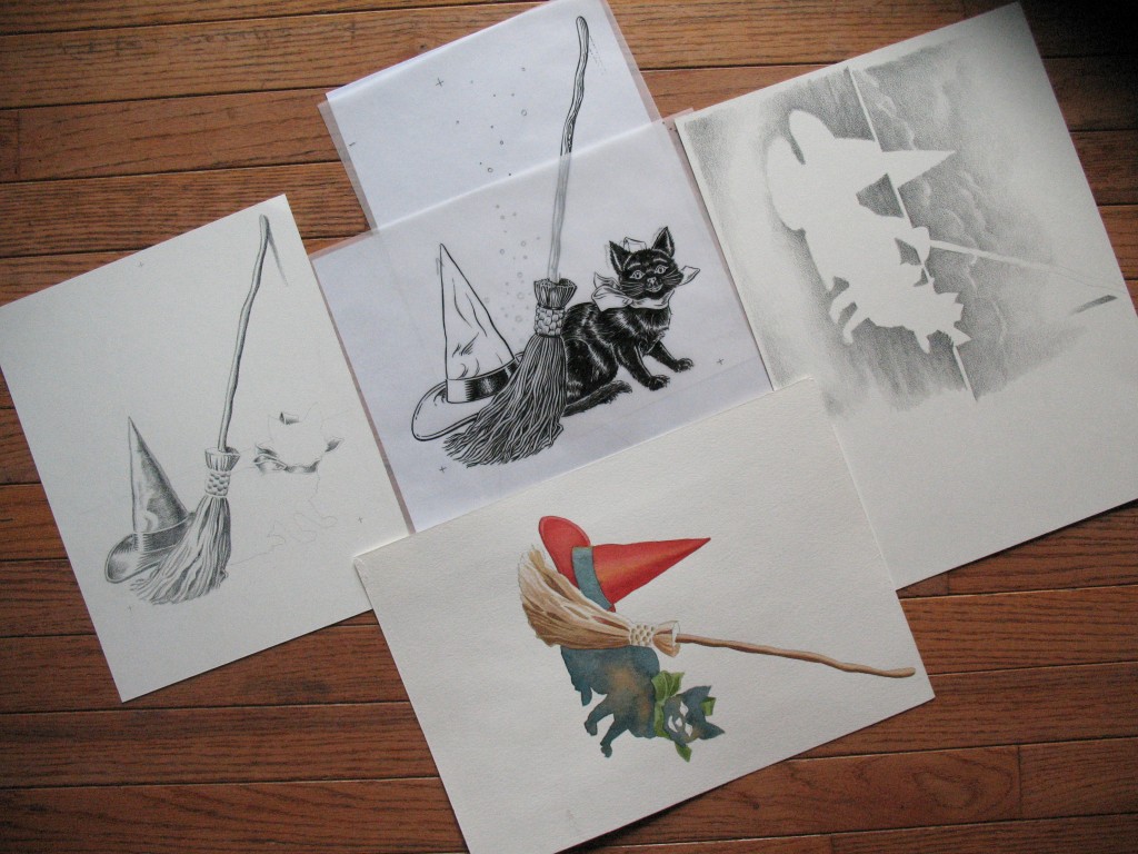
Here is a shot of his work in progress: one ink lined image, a watercolor layer, and a few coquille board renderings and some coloring and assembling in Photoshop. (Click for close-up view.)
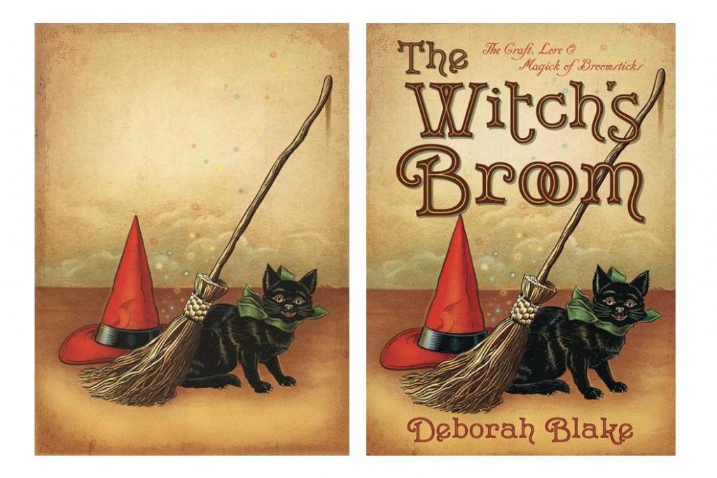
Cool, isn’t it? When he later sent us his final art, Lisa added the text elements to transform it into the cover you see now.
Ta-dah!
Overall, the elements of a successful cover come down to good ideas and inspiration generated by the author, expanded upon and experimented with by our in-house team, and fabulously talented people who actually know how to execute those brilliant ideas professionally. I have no idea how they do their work, but it’s simply amazing.
Deborah’s book was just officially released this week, and it’s among our top bestsellers this week per Amazon and Bookscan. That is the magic of a beautiful cover – it has a wonderful synergy with the contents and truly encourages people to pick up the book.
But wait, there’s more! Deborah’s book also benefitted from the truly bewitching illustrations of the talented Mickie Mueller. For a sneak peak into that process, read Mickie’s guest post on Deborah’s blog.
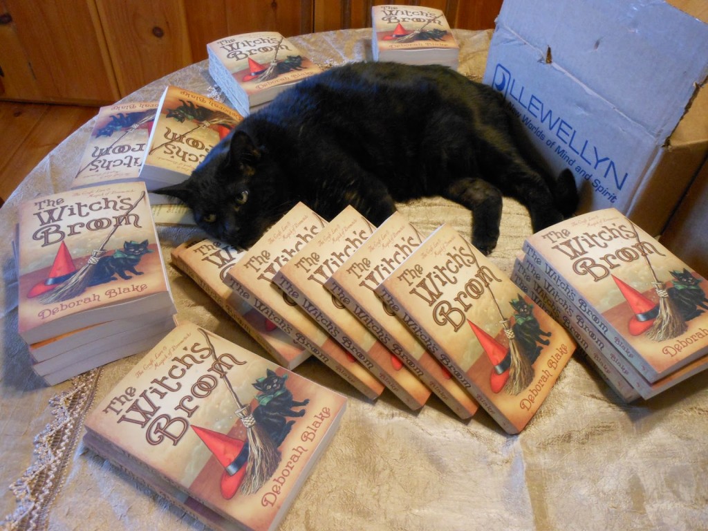
And finally… Deborah’s contented cat Magic, once again pleased that she was able to get Deborah, and thus Llewellyn, to do her bidding by featuring cats on more book covers. Cheers to you, Magic!




Dear Elysia,
All of this is so true. Deborah DID absolutely love the original postcard you shared with her. And we both love, love, love the way the cover turned out. But it might *just* be possible that I was the one who sent the email saying PLEASE PLEASE THIS ONE PLEASE.
No, wait–I’m a cat. I wouldn’t have said please. It must have been Deborah after all.
Thanks for sharing the story of our wonderful cover.
Familiarly yours,
Magic the Cat
What a great article. It is totally fascinating to see the process behind what we see on the shelves. I loved seeing all the different steps and how it all came together. Thanks for sharing the process.
I love it! Simply fantastic 🙂 I am currently looking at the potential future of getting my literature published and it really is stepping into a whole new world with the many processes it takes to bring an article of literature to commercial level fruition. This is quite a nice story about the art that goes into publishing a piece of work. Until I can get my own works published I am currently hosting books about spiritual enlightenment on this site: http://www.tarot-and-healing.com/ I find that the metaphysical world especially tarot is quite a magnificent subject but I digress. I look forward reading more glimpses into this world of publishing and creation.
As the artist tasked to assemble the art for this project, it is really fun to read the recounting of the process. Thanks.
Loved reading about this process… I had just been admiring Deborah’s new book on Amazon, because- well, what do you know? The cover caught my eye!